introduction
audible uk engaged me for creative support to produce a new website homepage using a range of UX/UI design processes.
To drive campaign objectives multiple versions of the Audible website homepage were designed by myself for mobile and desktop devices, producing a range of wireframes and user journeys based off user data and research the client had previously provided. These deliverable then participated in a standard A/B testing process.
in this project we dived into personas and Audible UK’s user research, as well as how i reached my own conclusions and justifications for the new user experience of audible.co.uk
two routes
goal: To educate the user of Audible’s app features, content and driving them to subscribe. This will include live demonstrations of the app, how to use Car Mode, Speed Narration, Sleep Timer etc. putting the app in-situ on different devices, taking inspiration from other competitor’s sites (e.g. netflix). Each touchpoint will be a different feature, pushing the user to learn more and subscribe.
language: Copy and language will be educational, clear and concise. The user needs to be educated quickly- the visuals on the site should do most of the talking for us, but we need short and snappy sentences to conclude the message.
personas: This route will cater for those who are more active and want to incorporate Audible into their everyday life, those of whom are active, on-the-go, and simultaneously like expanding their knowledge through the use of the app.
route 1: app features
goal: To educate the user of Audible’s plethora of content. This will be a more creative route, displaying the range of genres, collections and authors Audible can provide to the user through live playables. introducing new directions such as promoting Audible’s most recent content in the header as a rolling banner, as well as using the celebrity narrators (such as Stephen Fry) as a main selling point.
language: Again, copy and language should be clear and concise, but will have a lighter, fun tone to compliment the content displayed. Content is king on this route, so copy should be a complimentary element, reinforcing the messages and KSPs we want to deliver.
personas: This route will be a very creative and visual homepage display. Most of the Personas provided are deemed to be quite creative, therefore we feel this route will cater to those who want to be taken to another world and explore their creative interests.
route 2: content focused
route 1 skeletals
route 1 wireframes
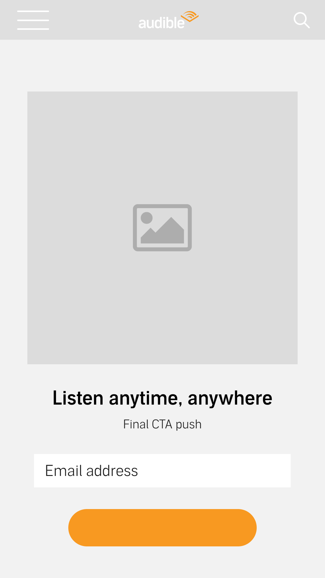
Route 1 takes huge inspiration from Audible’s existing advertising content. To optimise the user experience from a performance perspective, the hero image of the site (header) is designed to replicate the ad designs that Audible are currently running. The titles displayed in this header can be regularly updated over time in order to make this site more proactive than it currently is- consistently providing audible users fresh and updated content.
Scrolling down, the user will have multiple opportunities to interact with the site via playables and app demonstrations. The aim for this is to show how the Audible app fits into their user’s lifestyle, demonstrating it’s ease-of-use and familiarising them with the app’s features, all the while promoting titled content.
Section 2 will have animated app demos depicting the user scrolling through a library and choosing a title. Section 3 will be displaying app features including car mode, sleep timer, and narration speed. The phones displaying each feature will carousel and rotate continuously. A library browsing section will be included, CTAs will be placed throughout the page, driving the user to click through.
In terms of branding, the primary colours of solar orange and black a dominant throughout. chevron imagery is included as well as gradient curves (defined as ‘The Echo pattern’ within the latest Audible brand guidelines) to emulate the Audible logo and provide a sense of depth to the site.
route 2 skeletals
route 2 wireframes
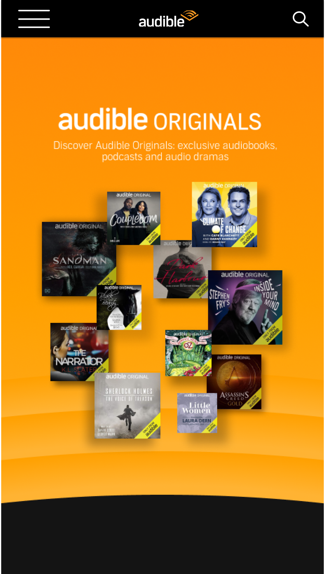
Route 2 aims to appeal to the more creative side of the Audible persona. Taking them away into another world of storytelling and content.
The hero image will be a rolling carousel, giving you the opportunity to promote new and upcoming titles users can download or pre-order. Again, this can be regularly updated to keep the site proactive and fresh for your customers. this Route aims to be entirely content focused, in the following sections we recommend promoting a plethora of title genres through rolling carousels, in these wireframes the carousels are currently promoting ‘Trending Now’, Podcasts, and Best Sellers but these genres can be changed over time to appeal to a wider audience. Again, there will be app demonstrations as well as title samples for user interaction and education.
With branding, this page uses the not only the Audible primary colours but also a gradient of the tertiary tones. This is to tie in the branding that is widely used in the US for a global consistency and to create a juxtaposition to Route 1 which will maximise the A/B test results. Gradients are also currently trending within the design sphere and this could hopefully give their website a fresh and modern feel.


