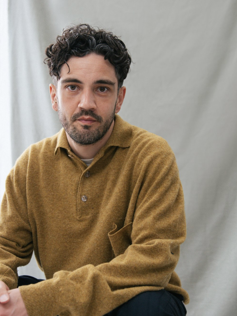

“lovely is about breaking away from the traditional headshot and creating something honest and meaningful in the process. “
dominic manderson - founder & photographer

logo process
When discussing with Dom what he wanted his brand to emulate, words such as ‘honesty’ and ‘meaning’ kept cropping up.
as the brand name suggests, he wants these portraits to be described as ‘lovely’ and this inspired us to create something handwritten. incorporating calligraphical typefaces seemed like the best approach.
these were the initial concepts in the first phase of the project.
the power of communication
In every project I take on, I want to collaborate with my clients as much as possible. I don’t believe in getting a brief and locking myself away until I have something shiny and polished to show you. I want to maintain open communication, I want to show you my creative thought processes, and guide you through yours. This is when the magic happens and we get the best results.
Dom and I went through multiple iterations of calligraphy typefaces, but we agreed it wasn’t personal enough for the brand. Whilst discussing how letters ‘loop’, we found a diamond in the rough.
The final logo, featuring Dom's handwriting, brings the unique and personal touch he was seeking. It evokes a sense of authenticity and craftsmanship, distinguishing Dom’s photography in a world of digital uniformity. It suggests warmth, creativity, and individuality, almost as if the customer had written it themselves for their own portrait.
if you want to find out more about lovely, head over to lovelyphotos.co.uk


